
Let Color and Texture Establish the Character
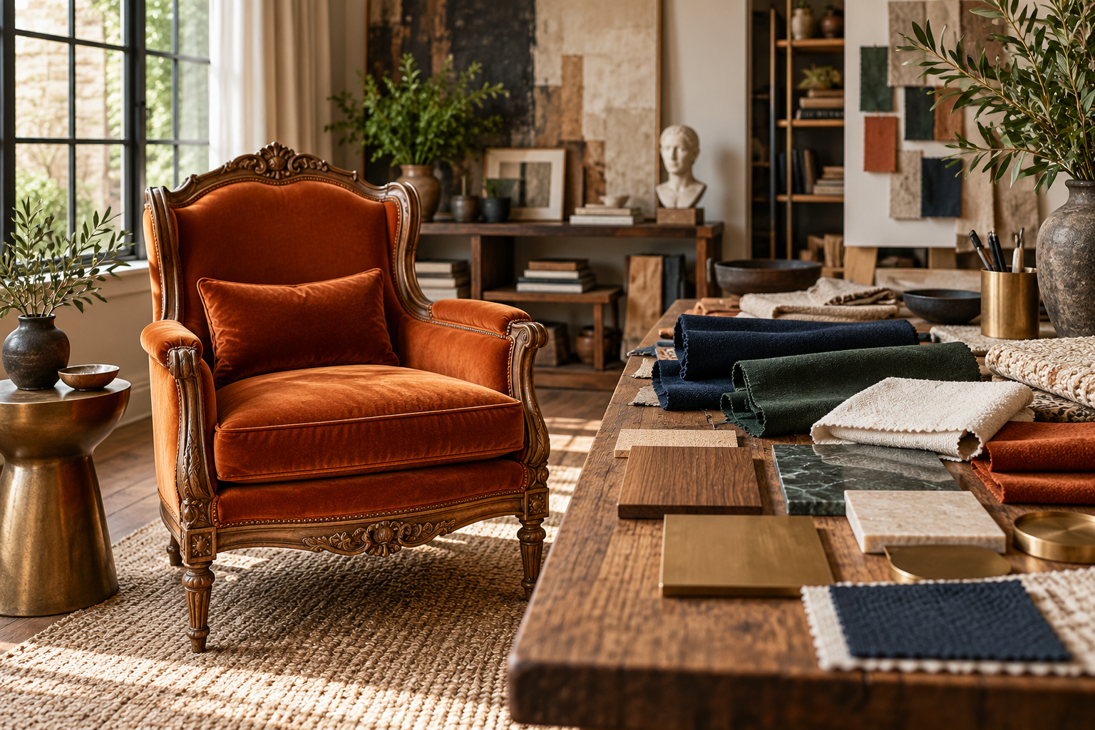
Imagine one sculptural seat finished in warm timber and orange cloth, another in pale mineral tones and ivory upholstery, and a third in deep teal with bronze accents. Their outlines may be similar, but their character is not. Color and texture shape the first impression of statement seating before anyone examines its construction.
Begin with the intended atmosphere and setting. A playful attraction, a ceremonial moment, and a quiet architectural interior may call for different relationships between frame and fabric. The aim is a coordinated physical palette that works with the occupant, surrounding materials, and actual light rather than a familiar formula of royal colors.
Throne Foundations
- Name the desired mood before comparing fabrics.
- Review upholstery within the room's existing palette.
- Choose fabric and frame finish together.
- Consider how much of the chair each material occupies.
- Evaluate texture on the actual proposed shapes.
- Plan pattern placement around panels, seams, and tufting.
- Give trim a deliberate visual role.
- Test samples under relevant lighting.
- Connect the textile specification to the chair's use.
- Document the exact approved material combination.
Royal Facts
- The same fabric can appear different beside different frame finishes.
- A larger upholstered area gives a color more visual influence.
- Fabric pile can change appearance with direction and light.
- Tufting alters the way a pattern is seen across a backrest.
- Contrast piping emphasizes an edge.
- A decorative cushion changes the effective sitting position.
- Closely related pale colors may separate clearly when placed together.
- A screen image does not convey every aspect of texture and sheen.
- A care instruction belongs to a particular textile or finish system.
- An exact fabric reference is more specific than a color name.
Royal Picks
- Request representative physical fabric samples.
- Place the proposed frame finish directly beside the upholstery.
- Include trim samples in the same review.
- Ask for a pattern-placement discussion with the upholsterer.
- Use a chair drawing to keep the material board grounded in the design.
- Review samples in daylight and evening light.
- Take an occupied test photograph for a portrait chair.
- Keep textile specification and care information together.
- Record the chosen sample references in the order.
- Retain a small approved sample for future matching discussions.
Behind the Throne
- The amount of a color can matter as much as the color itself.
- Quiet upholstery can let a complicated carved frame become clearer.
- A simple frame can give a distinctive textile room to lead.
- A pattern's repeat needs to be considered before fabric is ordered.
- An edge detail can sharpen or soften the chair's character.
- A large swatch may reveal variation hidden by a small sample.
- An empty-chair photograph does not show how clothing interacts with the palette.
- A material substitute deserves a fresh review rather than an assumed approval.
- Too many secondary accents can weaken a strong main textile.
- Restyling a contemporary chair and altering historic upholstery are different decisions.
Throne Wonders
- Pair burnt-orange velvet with dark carved timber.
- Use forest-green fabric within a pale natural wood frame.
- Let a quiet ivory textile soften sculptural bronze details.
- Create richness through texture while keeping the palette narrow.
- Use contrast piping to outline a restrained geometric cushion.
- Choose a patterned back with a quieter coordinated seat.
- Repeat one upholstery color in a small room accessory.
- Explore deep blue fabric beside a warm matte finish.
- Let a personal textile replace an expected royal color formula.
- Make a subtle tonal trim the detail that rewards a closer look.
Throne FAQs
- Is velvet required for a throne? No. Choose a textile suited to the mood, form, and intended use.
- Should the frame and fabric match? They should relate intentionally; matching is only one option.
- Can an ornate frame use patterned upholstery? Yes, but review the interaction between both pattern languages.
- Why ask about pattern placement? Seams, tufting, and panel shapes can interrupt the motif.
- Does a neutral fabric look less royal? Not necessarily; proportion, texture, and setting can provide presence.
- How do I judge a color online? Treat the screen image as a starting point and request a sample when possible.
- What does contrast piping do? It draws attention to the upholstered edge.
- Should a portrait chair be tested occupied? Yes. Clothing and the person affect the final composition.
- Can I clean every upholstery with the same product? No. Follow guidance specific to the actual material.
- What should the approval record include? The exact fabric, finish, trim references, layout decisions, and agreed substitutions.
Begin with the Mood and the Existing Room
Decide how the chair should feel within its setting. A reading throne may need warmth and visual ease. A portrait chair might benefit from a clear frame around the occupant. A ceremonial pair could need a coordinated identity that remains distinct from the surrounding flowers and textiles. Naming that mood narrows the choices more usefully than beginning with every available fabric sample.
Then look at the room's permanent surfaces. Flooring, wall color, window light, and nearby furniture already create a palette. Your throne can repeat one element, introduce a contrast, or become the dominant color. Those are different strategies. Choose one deliberately so the chair does not become a collection of attractive finishes that have no relationship to the place where it will stand. A personal color becomes more persuasive when the surrounding composition gives it a clear role.
Choose the Frame and Upholstery as a Pair
A fabric's appearance is influenced by the surface around it. A warm wood frame can make a blue textile feel different from the same textile inside a pale painted frame. A highly reflective metallic finish can introduce contrast and highlights that are absent from a matte sample board. Place proposed materials together before judging any one of them in isolation.
Try several combinations rather than assuming the first attractive fabric is the answer. Burnt orange can connect beautifully with dark carved wood; forest green can provide depth beside a lighter timber; an understated neutral can let sculptural metalwork lead. These are creative possibilities rather than fixed rules. Review the proportions as well: a narrow fabric insert has a different impact from a large upholstered back and generous seat. The amount of each material matters as much as its individual color.
Understand Texture at the Chair's Scale
Texture creates richness even when the color palette is restrained. A smooth textile can emphasize the shape of a cushion, while a more visibly woven surface introduces another rhythm. Plush fabrics can change appearance with the direction of their pile and the movement of light. A fabric that looks uniform in a small online image may reveal much more variation in a larger sample.
Handle representative samples and ask the upholsterer how the chosen material behaves on the proposed forms. A tightly shaped arm, a broad flat panel, and a deeply tufted back ask different things of the textile. Consider the expected contact and care as well as the visual effect. The best sample is not simply the one that feels luxurious between your fingers; it is the one that remains appropriate when translated into the actual chair and its intended use.
Give Pattern Enough Space to Make Sense
A patterned fabric needs a relationship with the shape it covers. A large motif may be striking on a broad back but fragmented across narrow panels. A small repeated design may become busy beside dense carving. Seams, buttons, and tufting can interrupt the pattern, sometimes producing a deliberate rhythm and sometimes creating visual confusion.
Ask to review how the pattern will be placed, including the main motif, repeat, and direction. A photograph of a loosely draped sample is useful but does not replace the upholsterer's layout planning. If the frame already contains elaborate ornament, try a quieter fabric before adding another complex design language. Conversely, a simple frame may provide the perfect setting for a distinctive textile. The aim is to let pattern contribute a clear idea instead of competing with every other detail.
Treat Tufting, Piping, and Trim as Design Decisions
Tufting divides a surface into a pattern of depth and shadow. Piping outlines an edge. Braid, nailhead-style details, fringe, and tassels can introduce another scale of ornament. These features influence the throne's character even when they use the same color as the main upholstery. They should be selected alongside the fabric rather than added automatically at the end.
Choose which edge or area deserves emphasis. Contrast piping can sharpen a cushion silhouette; a matching edge can keep the composition softer. Dense trim may suit a theatrical concept and feel excessive on a chair whose carving already provides a strong border. Review how accessories affect the usable seat too. A decorative cushion or thick bolster changes the occupied position. The finished appearance and the seating experience belong in the same conversation.
Test Color in the Light That Will Be Used
A fabric choice made under one light source can surprise you elsewhere. Daylight, warm room lamps, venue lighting, and camera exposure can change the relationship between textile and frame. This is especially noticeable when several close colors sit together or when a shiny surface introduces strong highlights. Review samples in the intended setting at relevant times of day whenever possible.
For an event or production, ask for a representative lighting test if the color relationship is central to the result. Include someone seated so skin, clothing, and upholstery can be assessed together. A chair can look wonderful empty and become a poor background for the intended portrait. You do not need to eliminate every variation. You need to understand whether the variation supports the intended mood and keeps the important parts of the composition readable.
Connect Fabric Choice to Real Use and Care
An everyday chair, occasional portrait seat, and touring prop have different use patterns. Discuss the actual activity with the upholsterer or supplier, including expected contact, cleaning needs, and exposure conditions. Ask for the relevant fabric specification and care guidance. A broad marketing word such as 'durable' is less useful than information about the proposed textile and the work it is expected to do.
Keep care choices specific to the material and finish system. A product suitable for one upholstery type may not suit another, and surrounding painted or metallic details can complicate treatment. If you are considering a historic or significant throne, upholstery replacement is a separate conservation decision rather than an ordinary restyling exercise. For a contemporary commission, retaining fabric references and replacement information can make later maintenance or reupholstery easier to discuss.
Build a Small Material Board You Can Approve
A useful material board gathers the main upholstery, frame finish, trim, and any secondary textile in the proportions that roughly reflect the chair. Add a photograph or drawing of the proposed silhouette. This keeps the conversation connected to the object rather than a collection of unrelated samples. Include identifying references so the maker can distinguish a general color direction from the exact material selected.
Limit the number of competing alternatives as the decision develops. Too many nearly identical swatches can make the process less clear. Compare the strongest combinations against the purpose and room, then document the chosen one. If a sample is unavailable or a substitute becomes necessary, review the change explicitly. A coherent approval process helps preserve the design idea through ordering and making, when small undocumented substitutions can produce a surprisingly different result.
Make the Palette Part of the Whole Design
Review frame finish, upholstery, trim, backdrop, and clothing together when the setting allows. Test enough material to understand direction, texture, and pattern scale. A tiny swatch cannot explain what happens across a tall back or around a curved arm.
The final palette should make the silhouette clearer and the intended mood more convincing. Strong color does not need to cover every surface, and a restrained material can give an expressive form room to speak. Treat upholstery and finish as connected design decisions from the start.
Related Articles

Commissioning Custom Seating: Turn an Idea into a Clear Design Brief
A striking idea becomes a successful commission through clear decisions. Learn how to turn inspiration into a practical throne design brief, collaborate with a maker, review samples and…
Designing Statement Seating: Form, Comfort, and Fit
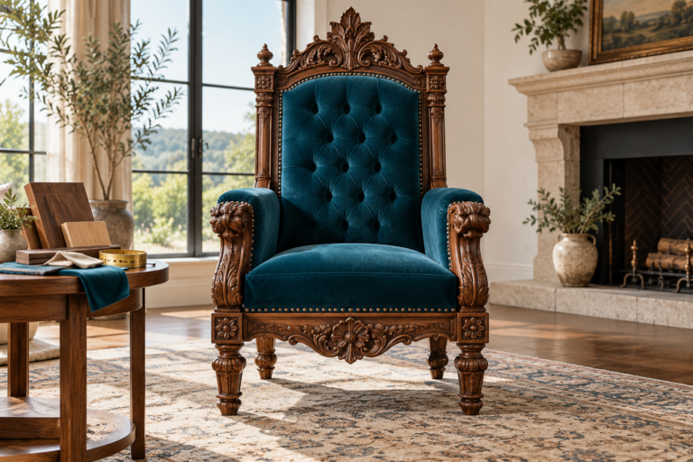
A memorable seat needs more than a striking silhouette. Explore how form, usable dimensions, comfort, materials, and setting work together to turn an imaginative chair into a convincing…
Designing a Seating Focal Point: Backdrops, Lighting, and Space
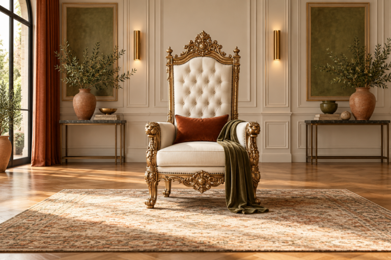
Turn a remarkable chair into a complete scene. Discover how backdrops, lighting, scale, surrounding furniture, and clear circulation give statement seating a strong place within an interior, event,…