
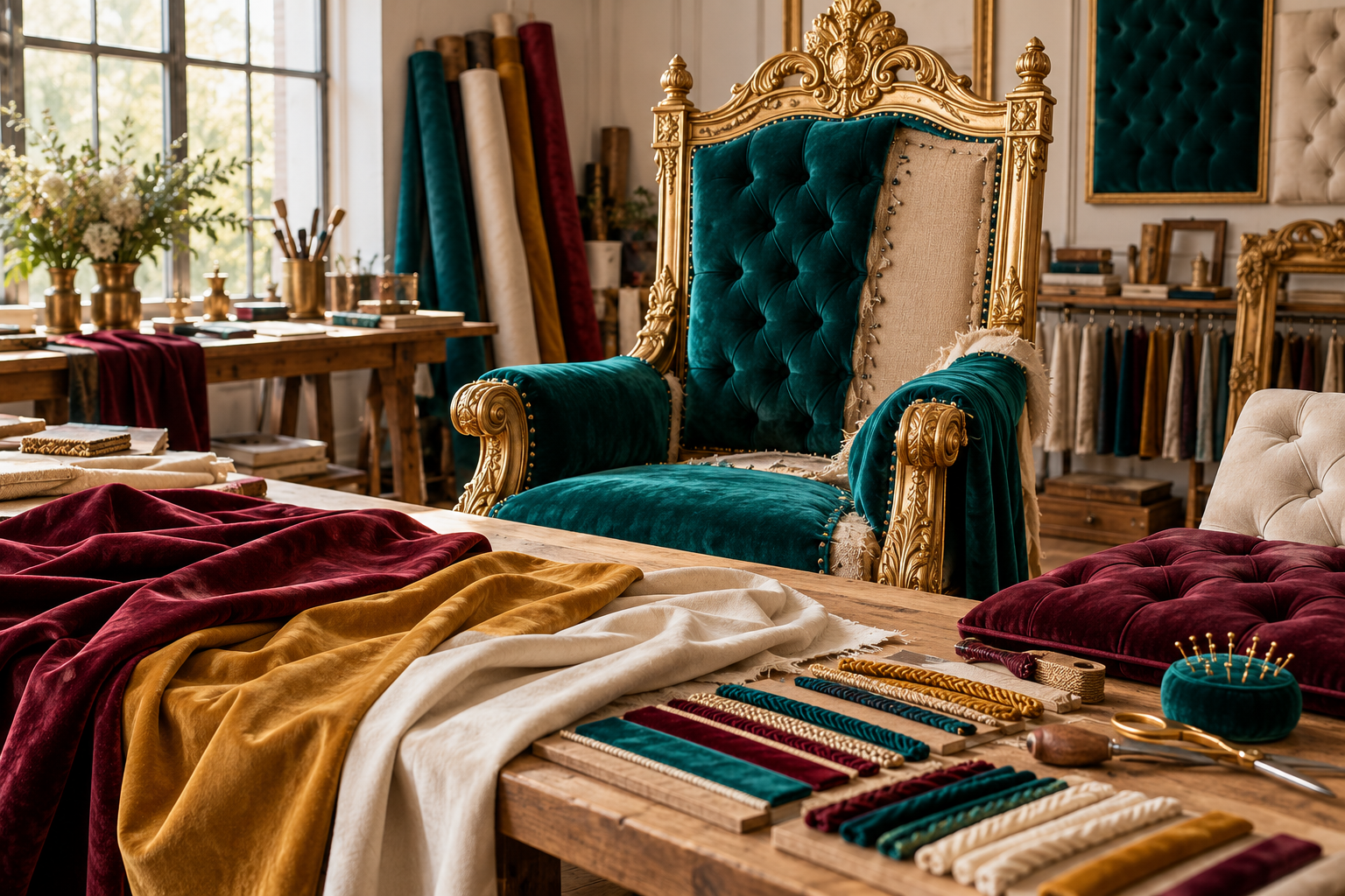
Color can make a throne feel regal, playful, calm, mysterious, or warmly domestic before anyone examines its carving. Upholstery gives that palette a physical surface, bringing texture, pattern, sheen, and softness into the composition. Color, Texture & Upholstery explores how those choices work together. Look beyond the familiar pairing of purple and gold to burgundy, teal, ivory, forest green, warm timber, bronze, and more restrained combinations. Consider the sitter's clothing, the background, and the light in which the chair will be seen. A small swatch can behave very differently across a tall upholstered back, especially when nap or a large pattern changes the visual direction. Compare piping, channels, tufting, smooth panels, and contrasting trim through the effect they create rather than ornament alone. This section connects design decisions with practical samples and carefully staged occupied mockups, helping you test the whole arrangement before committing. A successful palette does more than announce a theme: it clarifies the silhouette, supports the intended atmosphere, and gives the frame and fabric a convincing relationship within the room or scene.
Throne Foundations
- Build a palette around the chair’s frame, upholstered fields, trim, and surrounding surfaces.
- Choose which element should lead visually before giving every surface a strong color.
- Evaluate fabric color and texture together; a screen swatch cannot convey both.
- Pattern scale describes the size of a motif relative to the upholstered panel.
- Pattern repeat affects where the same motif appears across separate cushions or back panels.
- Nap direction matters for pile fabrics because the fibers change their appearance with viewing and light.
- Piping can outline a shape, while matching trim can soften its boundary.
- Tufting changes the upholstered surface’s relief rather than merely adding a printed pattern.
- Seat, back, and arm pads can share a fabric without requiring identical panel treatments.
- Confirm the covering’s care requirements before making color the sole selection criterion.
Royal Facts
- One fabric can look different on a flat sample and around a curved padded edge.
- A large motif may appear only partly within a narrow throne back.
- A seam can interrupt a repeating design even when the pattern’s colors match.
- Cutting several panels in different nap directions can produce an inconsistent appearance.
- A glossy frame can create brighter highlights beside a matte textile.
- A welt or piping line adds thickness at an upholstered boundary.
- Deep tufting can visually break up a large woven or printed motif.
- The frame’s finish can influence how adjacent fabric colors are perceived.
- Different upholstery batches should be identified when an exact coordinated order matters.
- Replacement coverings can change a throne’s palette without replacing its frame.
Royal Picks
- Compare full fabric swatches against the actual frame-finish sample.
- Use a larger cutting when a patterned textile’s small swatch omits important motifs.
- Mark the proposed motif center on a drawing of the back panel.
- Review paired chairs with the same pattern placement plan before cutting fabric.
- Compare matching piping with one carefully chosen contrasting color.
- Try a textured neutral when the carved frame already contains strong detail.
- Use a padded sample to review sheen and color around curves.
- Check the palette under the lighting intended for both everyday viewing and photographs.
- Keep a labeled record of fabric reference, colorway, supplier, and batch information.
- Ask the upholsterer how tufting, seams, and trim will interact with the chosen repeat.
Behind the Throne
- Lay out separate seat and back panels before assuming a motif will align between them.
- Specify nap direction consistently in the cutting and upholstery plan.
- A plain backing fabric may be intentional, but agree its appearance when the chair is viewed from behind.
- Compare fabric beside both shaded recesses and bright highlights on a metallic frame.
- Define whether a matching pair requires mirrored pattern placement or identical placement.
- Check how patterned fabric wraps around the side of a cushion rather than reviewing the top alone.
- Keep the chosen colorway distinct from the general fabric collection name.
- Review trim samples at the actual upholstered edge so their scale is not misleading.
- When replacing upholstery, photograph the old layout before deciding which details to retain.
- Record approved combinations together; separate approvals for cloth and finish can miss their interaction.
Throne Wonders
- A single contrast piping line can make a sculpted back easier to read.
- Different textures within one hue can create depth without a multicolored palette.
- A vivid inner back and quiet outer shell can give a throne two visual personalities.
- Centered motifs can turn a modest upholstered field into the main focal point.
- A plain seat can provide a resting point beneath a richly patterned back.
- Repeating one fabric accent in the backdrop can connect chair and room.
- A dark textile beside a pale frame can emphasize the silhouette between them.
- A softly textured covering can contrast with crisp geometric metalwork.
- A new upholstery palette can reinterpret an existing throne without inventing a new frame.
- A palette can draw from stone, foliage, ceramics, or textiles rather than defaulting to purple and gold.
Throne FAQs
- How many colors should a throne use? There is no fixed number; identify a dominant element and coordinate supporting surfaces around it.
- Can I choose upholstery from a website image? Use it to shortlist, then evaluate a physical sample for color, texture, and finish interaction.
- Why does velvet seem to change color? Pile direction, light, and viewing angle affect its appearance; compare samples in the planned setting.
- Does every panel need the same pattern center? Not necessarily. Agree which fields should align, mirror, or remain independent.
- Can a large print work on a narrow back? It can, but review which portion of the motif actually fits.
- Should piping contrast with the upholstery? Use contrast when outlining the shape is useful; matching trim gives a quieter boundary.
- Does tufting suit every pattern? Review a padded sample because the depressions and folds can interrupt motifs.
- Why keep the fabric’s exact reference? Collection names can contain several colorways, and later repairs need a precise identification.
- Can replacement fabric transform an old design? Yes. Reconsider its relationship with the existing finish and trim before proceeding.
- Must a throne use purple and gold? No. Develop the palette around its materials, occupant, and setting; royal presence can come from many color combinations.
Color and Upholstery for Statement Seating
Color and upholstery can transform the character of statement seating. Explore palettes, texture, pattern scale, seams, trim, and real lighting to create a coherent seat for interiors, events, and displays.