
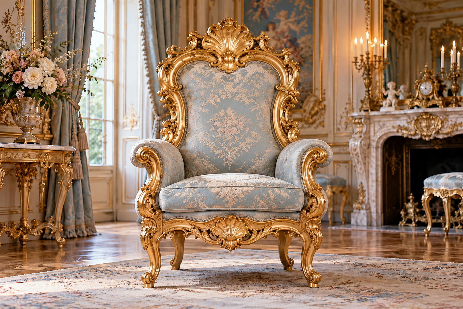
Sweeping curves, layered ornament, and coordinated surfaces can turn a throne into the center of an entire decorative composition. Baroque & Ornate Seating examines how these visual approaches shape royal seating while preserving the distinctions between them. Rather than treating both names as shorthand for anything lavish, look at the organization of the forms: symmetry and movement, mass and lightness, architectural presence and flowing detail. Study how carved frames meet upholstery, how a crest draws the eye, and how surrounding textiles or room decoration extend the design. An identified historical chair provides different evidence from a modern reproduction or fantasy interpretation, so dates and attribution remain part of the discussion. This section also considers contemporary use, where a richly ornamented seat may become a wedding focal point, a dramatic interior accent, or a scenic prop. Explore how restraint within the composition can make elaborate details clearer. The goal is not simply more gold or more carving, but a deliberate relationship between silhouette, surface, occupant, and setting that gives ornate seating its particular rhythm and presence.
Throne Foundations
- Treat Baroque and Rococo as related but distinct references, not interchangeable names for gold furniture.
- Begin with the whole composition: outline, seat, arms, crest, legs, and surrounding room.
- Scrolls introduce turning lines that can link separate carved components.
- Rocaille refers to ornamental rock- and shell-like forms within the decorative vocabulary.
- Curves should connect across the chair instead of appearing as unrelated additions.
- Balance the carved frame against the size and shape of upholstered fields.
- Distinguish deliberate asymmetry within ornament from an accidentally unbalanced chair outline.
- A gilded effect is a surface choice; specify how that effect is produced.
- Consider an ornate throne as part of an interior composition rather than a freestanding pile of motifs.
- Label modern interpretations clearly when they borrow period features without reproducing an identified object.
Royal Facts
- The V&A places Rococo’s emergence in France in the 1720s and 1730s.
- Its Baroque account emphasizes the coordinated use of painting, sculpture, and architecture.
- The Met’s eighteenth-century fauteuils demonstrate curves continuing through backs, rails, arms, and legs.
- The Met also documents transitional chairs combining Rococo curves with Neoclassical motifs.
- A shell motif alone cannot date a chair or establish its maker.
- Modern upholstery can appear on a historic frame; museum descriptions may identify that distinction.
- Raised carving catches light differently from a flat painted imitation of the same pattern.
- Metal leaf and metallic paint are different ways to create a reflective finish.
- A shaped upholstered back can echo the contours of its enclosing carved frame.
- A matching pair can repeat overall forms while carrying individually carved details.
Royal Picks
- Study the Met’s curving fauteuil profiles before assembling an ornamental reference board.
- Compare a bold central crest with a quieter crest that lets the upholstered back dominate.
- Request a scroll-carving sample with the proposed finish applied.
- Place fabric beside gilding samples to assess contrast, not just separate favorite colors.
- Compare wide floral patterns with plain textured coverings inside the actual back shape.
- Use elevation drawings to review where symmetrical framing gives way to freer ornament.
- Consider restrained trim when the surrounding carving already supplies substantial detail.
- Review the chair under side lighting to judge shadows within relief carving.
- For a pair, agree how closely hand-finished surfaces should match.
- For historic research, choose object records that identify altered finishes and replacement textiles.
Behind the Throne
- Follow a carved curve across component joints to see whether the design reads continuously.
- Check the side rails as well as the crest when assessing asymmetrical ornament.
- A highly figured fabric can obscure the outline of a shaped upholstered panel.
- Distinguish carved shells from loosely shell-like surface texture when describing ornament.
- Ask how deep recesses will be finished and later reached for care.
- Check whether a projecting scroll intrudes into the hand or clothing space.
- Compare finish sheen across broad surfaces and intricate details before approval.
- Keep an original frame’s date separate from the date of its current covering.
- Do not infer royal provenance from dramatic scale or a gilded crown.
- When adapting a historic reference, record which elements were simplified or enlarged.
Throne Wonders
- A continuous curve can make the legs and back feel like one flowing gesture.
- A restrained fabric can make carved ornament easier to appreciate.
- A dark frame with pale upholstery offers drama without a fully gilded surface.
- Small asymmetrical details can animate an otherwise balanced overall composition.
- A single carved shell can anchor a crest more clearly than several competing emblems.
- Light grazing across scrollwork can reveal depth that frontal lighting flattens.
- An upholstered panel can act as a quiet interval within dense carving.
- A coordinated wall treatment can extend the throne’s curves into its setting.
- A modern interpretation can retain movement while reducing the quantity of ornament.
- Comparing front and side outlines can reveal different rhythms within the same chair.
Throne FAQs
- Are Baroque and Rococo identical? No. Use specific period references rather than treating both as a generic ornate style.
- Must these thrones be gold? No. Evaluate the chosen finish separately from the chair’s form.
- What makes a curved design coherent? Curves that relate across back, arms, rails, and legs create continuity.
- Does asymmetry mean an uneven seat? No. Decorative asymmetry is distinct from the functional seating layout.
- Can plain upholstery suit elaborate carving? Yes. It can make the carved frame easier to read.
- Is metallic paint the same as gilding? No. Specify the actual surface treatment rather than its color alone.
- Can a chair mix Rococo and Neoclassical features? Yes. The Met documents transitional examples combining both vocabularies.
- How should I select patterned fabric? Compare its repeat against the actual upholstered panel, including seams and edges.
- Does elaborate ornament prove the chair is antique? No. Period attribution needs evidence beyond appearance.
- How do I simplify an inspired design? Preserve a defining curve or crest, then reduce competing secondary ornament.